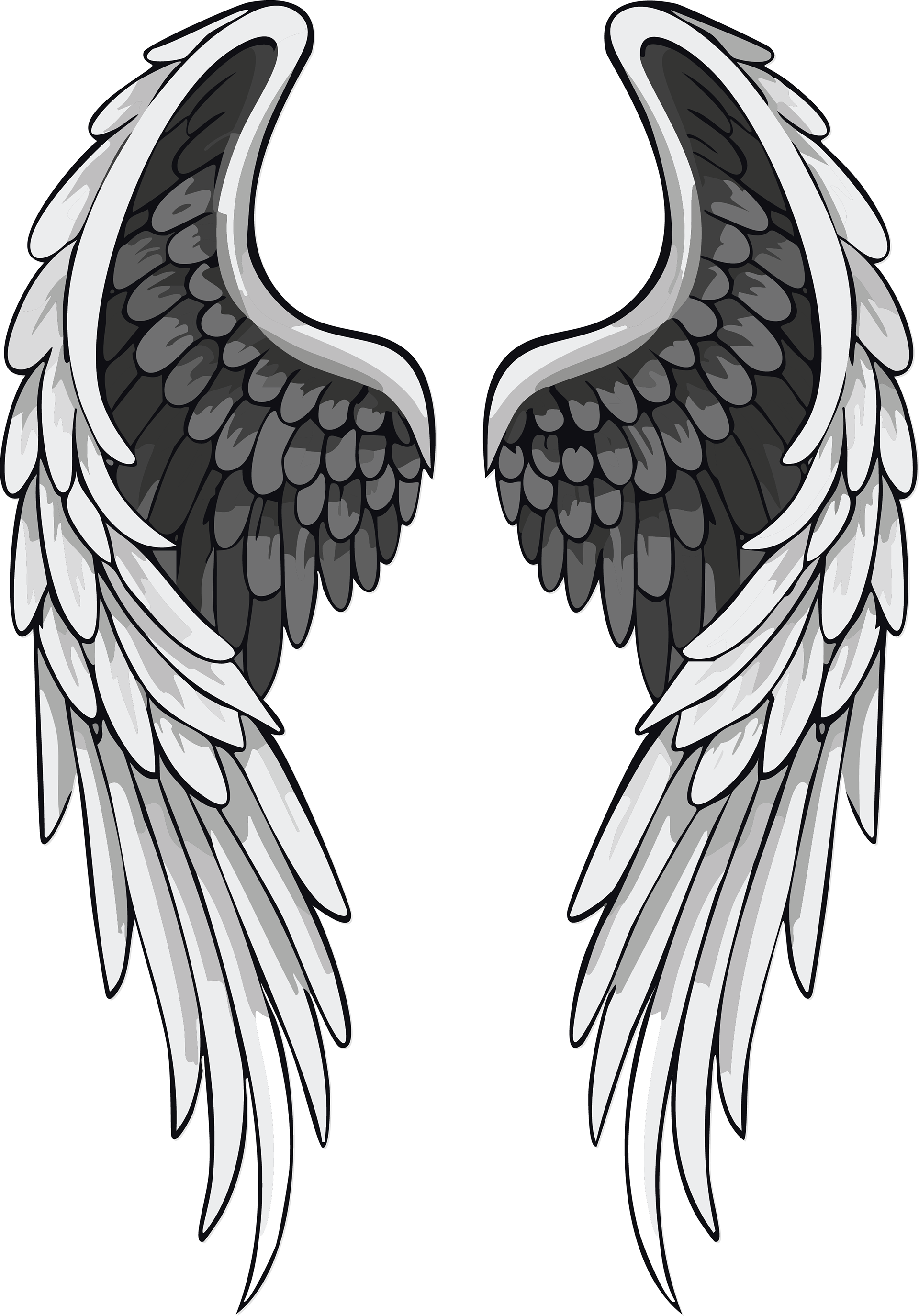
The first company I came up with this semester was Angel Wings Vodka, a brand that sells 80 proof vodka of different flavors. The idea was to make it as aesthetically pleasing as possible so that people collect the bottles and flaunt them all over social media. More than an alcohol brand, I sought to make Angel Wings more of a trend. I gave it an edgy style that would resonate with young adults in the alternative/punk scene, and used imagery that would be relatable and appealing to them.
ANGEL WINGS VODKA MERCHANDISE

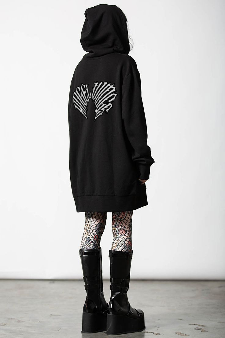
I took inspiration for this design from heavy metal band T-shirts. I really wanted to create merchandise that would actually be wearable and not look like an advertisement whenever you wear it out in public. I thought the kind of crowd that I'm trying to appeal to would love this kind of design, and I think I'm right because I would totally wear these myself!
ANGEL WINGS VODKA AD CAMPAIGN
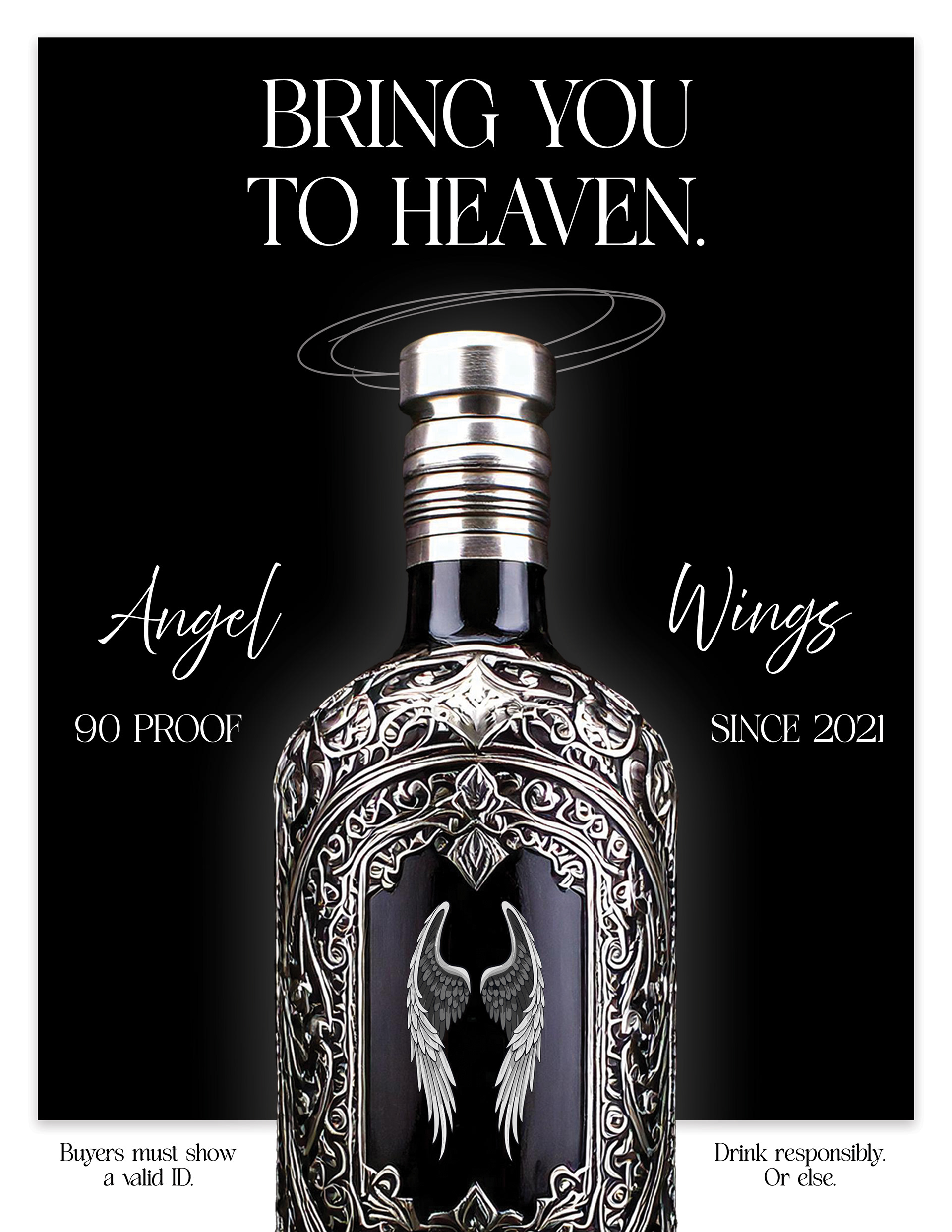
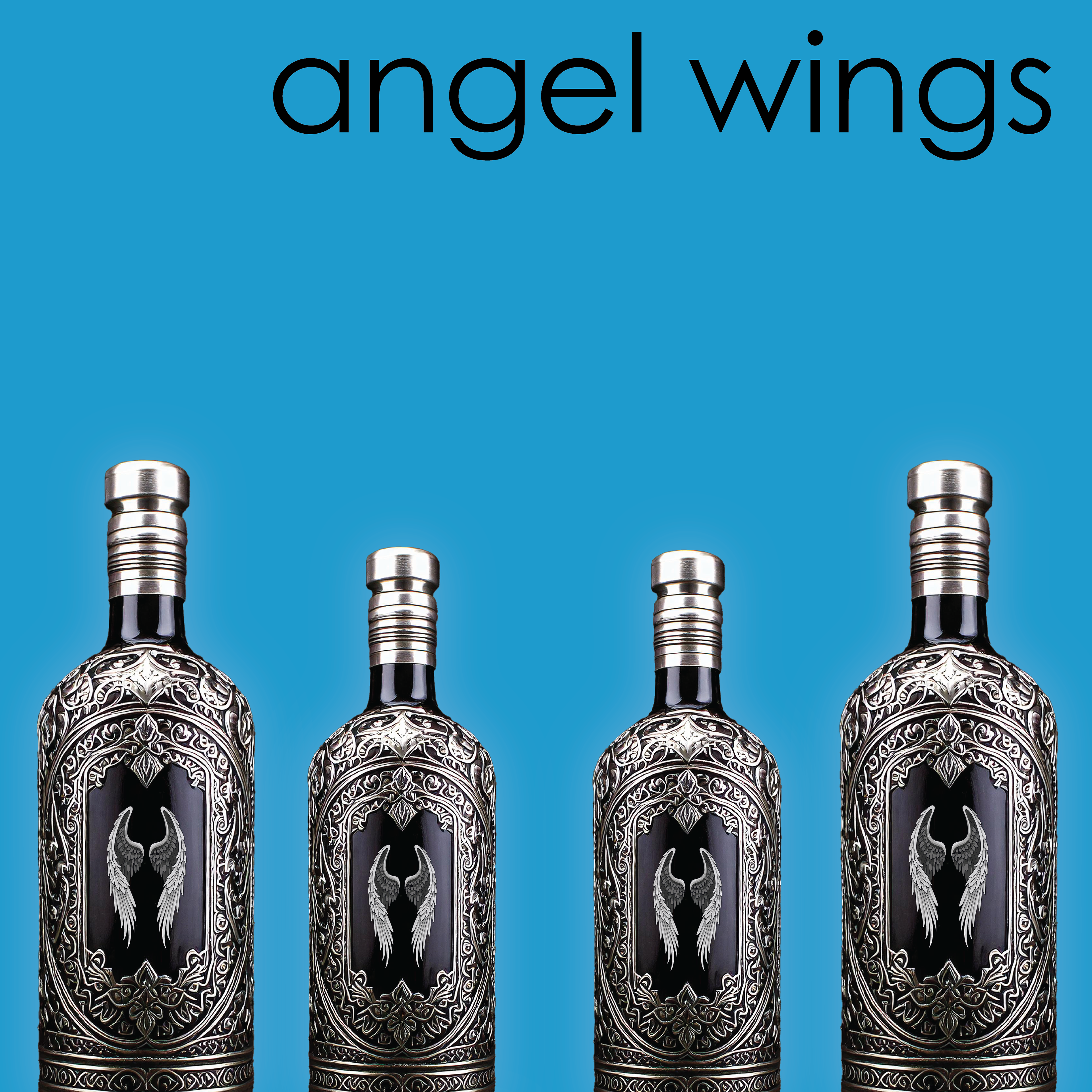
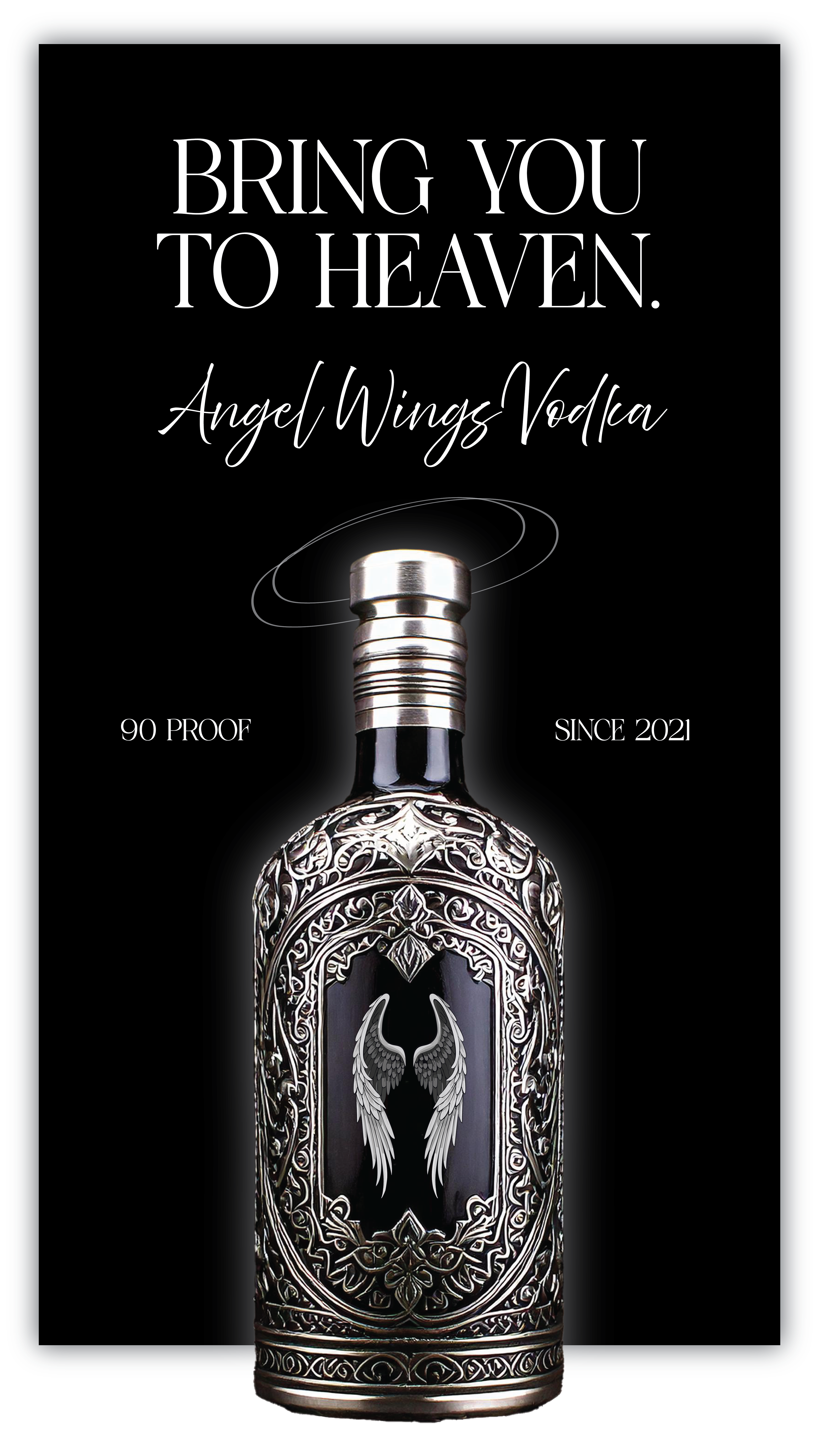
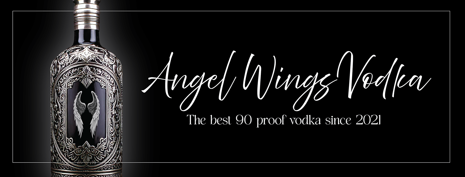
For the ad campaign, I wanted to keep it really classy, something that would catch your eye in a magazine, with heavy contrast. If the blue one looks out of place, that's because this was the one I did for the social media post. It is an overt reference to Weezer's Blue Album, where the album cover has been spread around and edited as a meme. I figured it would be relatable and comedic to the audience this brand wants to attract.
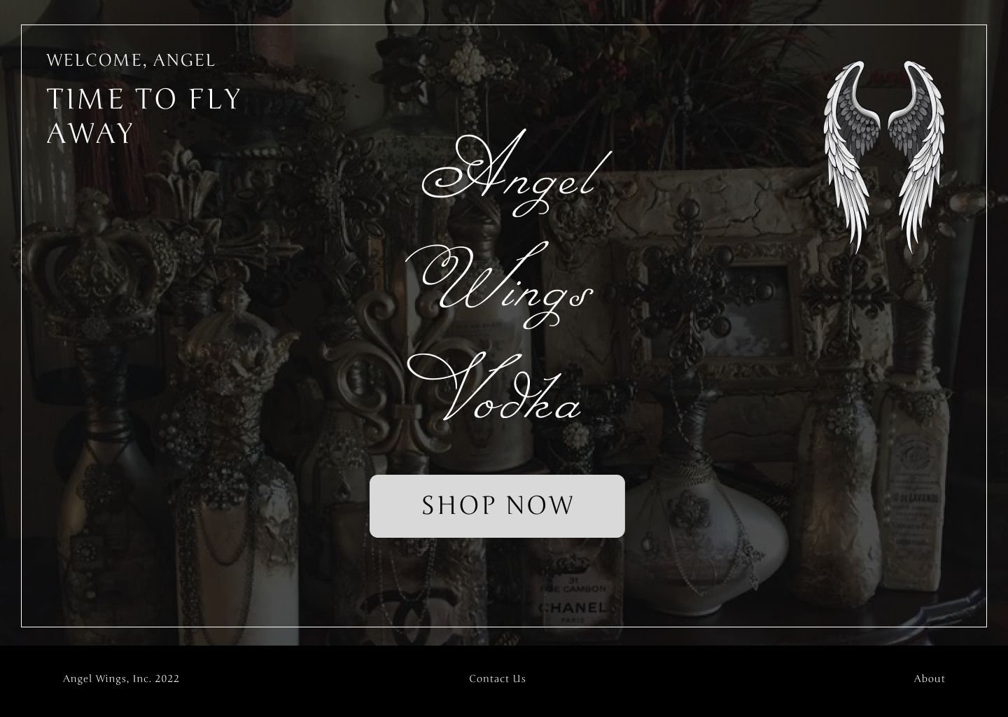
ANGEL WINGS VODKA WEBSITE - WEB

ANGEL WINGS VODKA WEBSITE - MOBILE
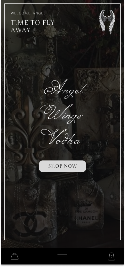
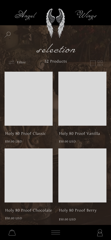
When creating the website, I wanted it to look sleek and professional, but also aesthetically pleasing. I like the contrast of black and white, but I thought that using brown for this design would give it a unique edge. I designed all the icons myself and I think the product came out really nice!